
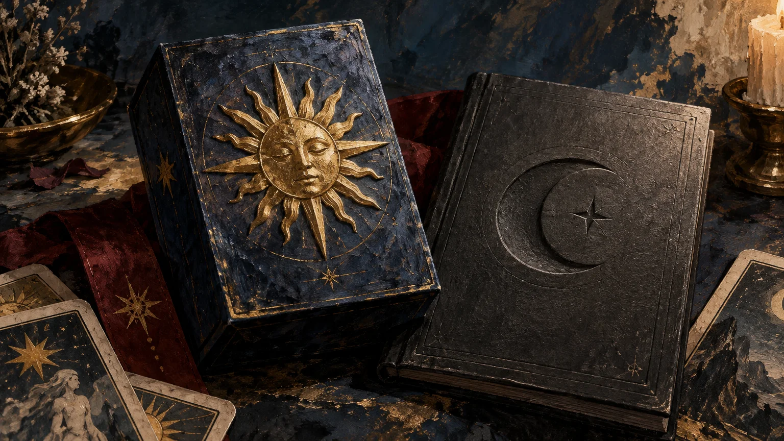
The simplest emboss vs deboss decision is this: choose embossing when you want a symbol or title to rise from the surface and catch light; choose debossing when you want it pressed inward for a quieter, more grounded impression. Neither is automatically more luxurious. The right finish is the one that supports the emotional language of the deck and survives the engineering demands of its box, guidebook, or insert.
For most tarot projects, I would reserve the effect for one deliberate focal point rather than adding relief to every available surface. A raised moon, recessed title, or gently formed publisher mark can create a meaningful first touch. Too many dimensional elements can muddy the hierarchy and compete with the artwork before the reader has even drawn a card.
Emboss vs deboss: the physical difference
Embossing forms paper or paperboard into raised relief. Debossing forms an indentation. Both are permanent physical changes to the material, not shadows or highlights printed to imitate depth. The process uses pressure and dedicated tooling to shape the board, commonly involving a die and a corresponding counter-die or make-ready arrangement.
For a technical overview of the process and material considerations, the Iggesund embossing and debossing guide is a useful starting point. It explains why the finish cannot be considered separately from the board: strength, flexibility, surface character, and resilience all affect how well relief forms and holds. Finished sheets can also lose some relief when stacked tightly, making a production sample more valuable than a screen mockup.
| Decision point | Emboss | Deboss |
|---|---|---|
| Relief direction | Rises above the surrounding surface | Recedes below the surrounding surface |
| Typical visual character | Declarative, luminous, or emblematic | Quiet, intimate, archival, or grounded |
| Light response | Raised edges can produce noticeable highlights and shadows | The recess can hold shadow and reveal itself more gradually |
| Touch | The fingertip encounters a projecting form | The fingertip settles into an impression |
| Useful tarot applications | Central sigil, moon, sun, crest, or short deck title | Guidebook title, botanical line, border fragment, or publisher mark |
| Opposite face | Must be checked for visible effects of the formed area | Must be checked for visible effects of the formed area |
| Production focus | Relief height, crisp edges, board resilience, and alignment | Impression depth, board resilience, fine detail, and alignment |
The descriptive moods in this comparison are creative directions, not guaranteed outcomes. A severe geometric emboss can feel restrained, while a deep deboss filled with reflective foil can become dramatic. Artwork, depth, color, material, and lighting shape the final character together.
Choose the feeling before the finish
Tarot packaging begins the reading before the cards appear. The hand lifts the box, the light moves over its surface, and the deck starts establishing its visual world. Ask what that first encounter should communicate.
Embossing often suits a mark that behaves like an apparition or emblem. Imagine a crescent moon rising from an indigo tuck box, a radiant eye catching side light, or a deck monogram given enough dimension to feel ceremonial. It is especially persuasive when one image deserves to stand forward from an otherwise restrained design.
Debossing can feel more private. A recessed title may resemble a mark pressed into an old journal, a carved inscription, or a botanical specimen label. That makes it a natural route for decks built around archives, earth, memory, shadow work, herbals, or quiet contemplation.
Do not choose by mood alone, however. Look at the entire composition. If the illustration is already rich with metallic ink, ornate borders, and layered typography, a blind deboss may give the eye somewhere to rest. If the box is visually spare, a single embossed emblem can supply the focal point without requiring another printed color.
Where tactile relief belongs in a tarot set
Tuck boxes
A tuck box is an obvious place for dimensional finishing because it creates the first physical encounter while leaving the cards themselves unchanged. Supplier offerings confirm that embossing, foil-and-emboss, and foil-and-deboss can be available for tarot-size tuck boxes. For example, MakePlayingCards lists these options on a custom tarot tuck-box product, along with a supplier-specific 300 gsm, 16 pt C1S art-board configuration. That specification is an example, not a universal requirement for tarot packaging.
Relief should stay clear of folds, scores, glue areas, and vulnerable edges according to the printer’s dieline and tolerances. The box structure also determines which interior or reverse surfaces remain visible. Review those surfaces instead of approving only a flat front-panel rendering. For broader help choosing between box structures, begin with tarot deck packaging options before specifying the finish.
Rigid boxes
A rigid box offers a substantial canvas, but its wrapped construction introduces different material and forming questions. Confirm whether the relief is produced in the wrap, the underlying board, or another component, and ask the manufacturer to explain how the assembled structure affects depth and alignment. Do not assume a finish offered for a folding carton transfers unchanged to a rigid box.
Guidebook covers
A guidebook cover is well suited to a recessed title, small emblem, or restrained frame because readers encounter it repeatedly without shuffling it. Yet cover stock, lamination, binding, grain direction, and nearby folds can affect what is feasible. A tactile mark beside the spine needs particularly careful vendor review.
If the full booklet budget cannot support dimensional finishing, let the guidebook cover carry the tactile moment and keep interior companion pieces simple. A concise interpretation card, ritual prompt, or care insert can instead be produced as a flat stationery element through a source for printed guide cards and companion inserts. This preserves a clear hierarchy: one dimensional hero piece supported by practical printed materials.
Belly bands, seals, and inserts
A belly band may support relief if its stock, folds, and assembly method allow it, but a narrow format leaves little room for error. A seal is usually better treated as a separate packaging decision rather than as a substitute for structural relief. If a short-run deck needs flexible presentation rather than custom tooling, stickers for tarot packaging and seals may offer a more adaptable route.
I would be cautious about embossing or debossing the tarot cards themselves. Relief could change handling, stacking, shuffle behavior, or the visibility of identifying marks. Unless a specialist manufacturer has evaluated the exact construction and supplied representative samples, keep dimensional effects on packaging and companion materials rather than frequently shuffled card faces or backs.
Blind relief or foil with relief?
A blind emboss or deboss uses the shaped material itself as the visual effect, without relying on printed ink or foil. The result is read through touch, highlight, and shadow. Foil can be combined with dimensional work using suitable tooling, but it introduces another alignment relationship between the metallic area and the relief.
Blind relief works beautifully when the paper color and texture are already expressive. It allows a symbol to appear gradually as the box moves in the hand. It can also prevent metallic decoration from overwhelming detailed card art.
Foil plus relief makes sense when the focal symbol must read immediately or when metallic light is central to the deck’s visual language. A solar deck might use a small gold foil-embossed disc; a nocturnal deck might use silver, holographic, or another printer-approved foil sparingly. The foil should clarify hierarchy rather than turn every border, star, title, and logo into a competing highlight.
- Choose blind relief when material, shadow, and touch should carry the design.
- Add foil when reflectivity is conceptually important and the focal mark needs stronger visibility.
- Use one principal dimensional element before adding secondary accents.
- Request a physical proof when registration between foil and relief is critical.
Engineer the artwork before falling in love with the mockup
A digital mockup can suggest atmosphere, but it cannot confirm whether a line will form cleanly, whether a laminate will cooperate, or whether relief will remain crisp after production and packing. Printers may require a separate finish file and place limits on intricate detail or thin lines. Those rules vary by supplier, process, and material.
Start with the final dieline, not a generic rectangle. Mark the emboss or deboss artwork on its own clearly named layer or in the separate file format requested by the printer. Keep the dimensional art simple enough to survive physical forming. Tiny stars, hairline vines, distressed lettering, and dense crosshatching may look exquisite on screen while becoming weak or congested in tooling.
Typography deserves restraint. A short title in a sturdy letterform is a more practical candidate than a paragraph of small text. Preserve counters inside letters, allow breathing room between shapes, and ask how the proposed depth interacts with the chosen type size. The printer’s minimum line and gap requirements should govern the production file.
Material selection is equally important. Board strength, flexibility, finish, and resilience influence the result, while tight stacking can flatten formed areas. A finish approved on one coated stock cannot be assumed to behave the same way on textured, laminated, recycled, or cloth-like material. Ask for guidance based on the actual substrate and assembled component.
A worked design example
Consider a moonlit botanical tarot deck with silver-gray linework, deep blue packaging, and a compact guidebook. There are two coherent routes.
The first is a restrained foil-embossed moon on the tuck-box front. The moon becomes the clear first focal point, while the title and botanical drawing remain flat. This route feels luminous and declarative. Its production questions concern foil registration, suitable line weight, relief height, and how the formed panel behaves after folding and assembly.
The second is a blind-debossed title with one recessed botanical sprig on the guidebook cover. The tuck box remains printed but flat, allowing the tactile discovery to happen after opening. This route feels quieter and more bookish. Its production questions concern cover stock, binding, spine clearance, impression depth, and whether the opposite surface remains acceptable.
Neither route is inherently better. Choose the first if the moon is the deck’s central emblem and should announce itself immediately. Choose the second if the deck’s personality is intimate and the guidebook is meant to feel like a field journal. The design decision follows the reading experience.
Printer handoff checklist
- Provide the final manufacturer-approved dieline and identify the exact panel receiving the finish.
- Name the intended component: tuck box, rigid-box wrap, belly band, guidebook cover, or insert.
- Confirm whether the effect is emboss, deboss, blind relief, foil emboss, or foil deboss.
- Specify the final board or cover material, coating, lamination, and assembled structure.
- Supply the finish art on a separate layer or in the printer’s requested dedicated file.
- Ask for minimum line widths, gaps, type sizes, and distances from folds, scores, cuts, glue areas, and edges.
- Confirm which face should rise or recess and inspect what happens on the opposite side.
- If foil is involved, confirm its relationship to the relief and the supplier’s registration tolerances.
- Request a representative physical sample made with the intended material and finish whenever possible.
- Inspect the sample in ordinary handling, direct light, side light, and stacked or packed conditions before approving production.
The practical recommendation
Choose embossing when a tarot symbol should rise, catch light, and act as the visual herald of the deck. Choose debossing when the title or motif should feel pressed, discovered, and quietly integrated into the material. Then narrow the concept to one focal point and place it on the component that can support it safely.
Your next step is not to perfect a glossy mockup. It is to send a simple finish layer, the real dieline, and the proposed material specification to the selected printer. Request a physical example or production proof, then handle it as a reader would. Turn it under side light, open and close the package, inspect the reverse surface, and look for lost detail or flattening. The finish is successful when the tactile moment strengthens the deck’s world without making the object harder to produce or use.
Frequently Asked Questions
What is the physical difference between embossing and debossing?
Embossing raises a design above the surrounding surface, while debossing presses it inward. Both physically form the paper or paperboard using pressure and dedicated tooling.
Can embossing or debossing be used without foil?
Yes. Blind embossing or debossing relies on the shaped material, highlights, and shadows alone. Foil can be combined with relief when stronger reflectivity is desired, but the foil and dimensional artwork must align correctly.
What should be confirmed with the printer before production?
Provide the final dieline, proposed material and coating, intended component, relief direction, and separate finish artwork. Ask about minimum line widths, fine-detail limits, clearance from structural areas, reverse-side effects, and physical proofing requirements. Exact artwork and material rules vary by supplier.